Introduction
Color is one of the most powerful elements in interior design. It sets the mood of a room, influences how spacious it feels, and creates either harmony or chaos depending on how it is used. Among the most common challenges homeowners face is selecting the right colors for large, visible furniture pieces such as tables, chairs, and cabinets. These must not only work together but also align with the existing colors of walls and floors.
In this comprehensive guide to choosing table, chair, and cabinet colors to match walls and floors, we will explore principles of color harmony, practical design strategies, and real-world examples that can transform any living space. Whether you’re furnishing a new home or refreshing an old one, this guide will help you make confident decisions that blend function with beauty.
Understanding the Basics of Color Harmony
The Color Wheel in Interior Design
The color wheel is the foundation of design. Warm tones like red, orange, and yellow create energy, while cool tones such as blue, green, and purple promote calmness. Neutral tones—gray, beige, white, and black—act as balancing anchors in most interiors.
Complementary vs. Monochromatic
Complementary palettes pair opposite colors (e.g., blue walls with orange-toned wooden cabinets).
Monochromatic palettes stick with one color family in varying shades, such as gray floors with charcoal cabinets and silver-accented chairs.
The 60-30-10 Rule
Interior designers often apply the 60-30-10 rule:
60% dominant color (usually walls or flooring),
30% secondary color (furniture),
10% accent color (decor, cushions, lighting).
This simple formula keeps rooms balanced while allowing creativity.
Matching Furniture Colors with Wall Paint
Light Walls and Bold Furniture
White, cream, or light gray walls provide a blank canvas. They allow for bold-colored tables or cabinets—think navy blue, forest green, or rich walnut wood. Light walls also help small rooms appear larger.
Dark Walls and Neutral Furniture
Dark walls, such as charcoal or navy, create drama and intimacy. Pairing them with light-toned chairs, white tables, or beige cabinets prevents the space from feeling too heavy.
Colored Walls with Harmonized Furniture
If walls are painted in distinctive shades (like sage green or terracotta), furniture colors should either be neutral to balance them or deliberately complementary for vibrancy. For instance, sage green walls pair beautifully with oak wood cabinets and cream-colored chairs.
Coordinating Furniture with Floor Colors
Light Wood Floors
Light oak or maple floors give rooms an airy feel. Furniture in contrasting tones, like dark walnut tables or black chairs, provides balance. Alternatively, soft pastel furniture can extend the sense of openness.
Dark Wood Floors
Rich mahogany or espresso floors look luxurious but need lighter furniture to avoid overwhelming the space. White or cream cabinets, light gray sofas, and natural rattan chairs balance the weight of dark flooring.
Tile or Stone Floors
Neutral stone or ceramic tiles pair well with warm wooden cabinets and neutral-toned chairs. For modern homes with gray concrete floors, adding colorful accent furniture prevents the room from feeling cold.
Carpeted Floors
For carpeted rooms, furniture should harmonize with the texture as well as the color. Neutral-toned tables and cabinets with fabric chairs in matching shades create cohesion without clashing with carpet patterns.
Choosing the Right Table Color
Dining Tables
Dining tables are focal points. For traditional dining rooms, dark wood tables pair well with cream or beige walls. For modern open-plan spaces, glass or light oak tables work beautifully with neutral floors.
Coffee Tables
In living rooms, coffee tables often contrast with sofas and flooring. A white coffee table brightens dark floors, while a walnut coffee table grounds light interiors.
Desks and Work Tables
For home offices, desks should complement wall paint for productivity. White desks pair well with pastel walls for a clean look, while black desks add seriousness to professional settings.
Picking the Perfect Chair Colors
Dining Chairs
When paired with wooden tables, upholstered chairs in neutral beige or gray add comfort and balance. Bold colors like mustard or teal can also serve as accents.
Lounge Chairs
Accent chairs can stand out. In minimalist interiors, a brightly colored chair can become the centerpiece. For cozy rooms, choose textured fabrics in earthy tones.
Office Chairs
Functionality is key, but color still matters. Black or gray office chairs pair with nearly any wall or floor color, while white or tan leather adds sophistication.
Cabinet Color Choices
Kitchen Cabinets
Kitchen cabinets dominate the room’s look. White cabinets remain timeless, pairing well with dark wood floors or colorful walls. Navy or emerald cabinets are popular in 2025, especially with brass hardware.
Living Room Storage
For living rooms, cabinets and shelving should blend into the walls if you want a seamless look. Alternatively, contrasting colors like black shelves on a white wall can create bold statements.
Bedroom Cabinets
Wardrobes and bedside cabinets should coordinate with bed frames and flooring. Light gray or soft wood finishes work best for calming environments.
Interior Styles and Color Combinations
Scandinavian Style
Scandinavian interiors rely on light wood furniture, white walls, and soft pastel accents. An oak dining table, white chairs, and pale gray cabinets fit perfectly.
Industrial Style
Industrial homes combine concrete floors, exposed brick, and dark-toned furniture. Black cabinets, leather chairs, and reclaimed wood tables enhance the raw, urban feel.
Modern Luxury
Glossy finishes, marble floors, and bold contrasts dominate modern luxury interiors. High-gloss black cabinets with cream chairs and glass tables suit this aesthetic.
Rustic Charm
Rustic spaces feature warm wood floors, beige walls, and earthy-toned furniture. Walnut tables, brown leather chairs, and oak cabinets create cozy harmony.
Mistakes to Avoid
Over-Matching
Matching walls, floors, and furniture in the exact same tone creates a flat, lifeless room. Aim for subtle contrast instead.
Ignoring Natural Light
Colors look different under various lighting. A cabinet that looks perfect in a showroom may appear too dark in a dim room. Always test samples in your space.
Forgetting Function
While aesthetics matter, furniture must also be practical. A white dining table may look stunning but could be high-maintenance for families with children.
Practical Tips for Choosing Colors
Start with the largest surfaces (walls and floors) and build furniture choices around them.
Use contrast strategically: light vs. dark, warm vs. cool.
Add accent colors through smaller pieces like chairs, cushions, or lamps.
Consider timelessness—neutral colors age better than trendy shades.
Incorporate textures: wood grains, fabrics, and metals enhance depth even with neutral palettes.
Future Trends in Furniture Color Coordination (2025 and Beyond)
Earthy neutrals: beige, taupe, and warm gray continue to dominate.
Bold cabinetry: navy, hunter green, and matte black gain popularity.
Mixed materials: furniture combining wood, glass, and metal with layered tones.
Eco-friendly finishes: low-VOC paints and recycled materials influence both sustainability and style.
The Psychology of Color in Furniture Choices
Colors are not only visual; they influence how we feel. Choosing the right shades for tables, chairs, and cabinets can create a specific atmosphere in your home.
Warm Tones for Energy
Colors like terracotta, walnut brown, or deep red bring warmth and vibrancy. Dining tables in these tones can make mealtime more inviting, while cabinets in warm wood create a sense of tradition and coziness.
Cool Tones for Calmness
Shades of blue, green, or slate gray calm the mind. A slate-colored desk in a home office can boost focus, while light sage cabinets in a kitchen can bring serenity to daily routines.
Neutrals for Balance
White, beige, taupe, and soft gray are timeless. They work in nearly any room, blending with different wall and floor colors without overwhelming the space. Neutrals also allow you to experiment with accent chairs or colorful décor.
Matching Colors by Room Type
Living Rooms
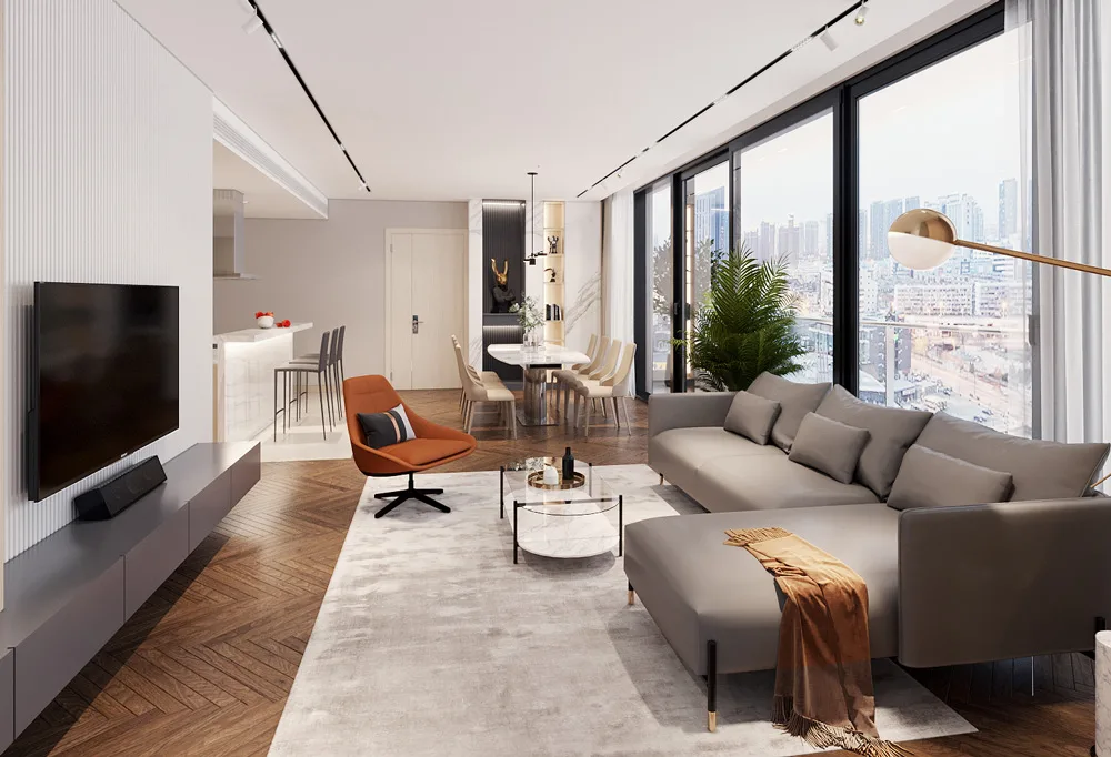
As the social hub of the home, living rooms benefit from balanced contrasts. If your walls are light beige and floors are oak, a darker walnut coffee table and cream cabinets create sophistication. For modern living rooms, pairing gray walls with a white TV cabinet and charcoal chairs achieves sleekness without monotony.
Dining Rooms
Dining areas should feel warm and communal. Earth-toned dining tables with upholstered chairs in neutral or pastel shades encourage comfort. If the walls are bold (navy or emerald), a natural oak table keeps the balance grounded.
Kitchens
Kitchen cabinets dominate the space. If you have white or light gray walls, bold-colored cabinets like navy, hunter green, or matte black add drama. For dark floors, lighter upper cabinets keep the kitchen airy. Tables and chairs in matching wood tones unify the space.
Bedrooms
In bedrooms, the goal is relaxation. Cabinets and bedside tables in soft gray or cream blend with pastel walls, creating a soothing palette. Accent chairs in muted tones can add subtle contrast without disturbing the peaceful vibe.
Home Offices
Productivity thrives in spaces with minimal distraction. Black or dark wood desks paired with neutral walls emphasize focus. Chairs in muted greens or blues can energize without being overwhelming.
Textures and Finishes Matter
Matte vs. Glossy
Matte finishes absorb light, creating subtlety. Glossy surfaces reflect light, making furniture stand out. For example, matte black cabinets feel understated and modern, while glossy black cabinets feel dramatic and luxurious.
Natural Wood Grains
Exposed grains in oak or walnut add depth and texture even if the colors are neutral. This makes them versatile for pairing with painted walls and varied flooring.
Fabric Upholstery
Chairs upholstered in linen or velvet influence how we perceive their color. A gray velvet chair feels more luxurious than the same color in cotton. Texture changes the mood.
Budget-Friendly Ways to Update Furniture Colors
Not everyone can replace large pieces of furniture, but small changes can refresh the entire room.
Repainting cabinets: A coat of paint can turn outdated dark cabinets into trendy sage green or classic white.
Chair slipcovers: Affordable slipcovers allow you to experiment with colors without buying new chairs.
Table runners and mats: Adding contrasting fabrics to dining tables introduces color without permanent changes.
Accents and hardware: Replacing cabinet handles with brass or black finishes updates the look instantly.
These approaches allow you to adjust furniture colors as trends evolve without overspending.
Case Studies: Small Apartments vs. Large Homes
Small Apartment Scenario
Maria lives in a 40m² apartment with white walls and gray laminate floors. To maximize openness, she chose a light oak dining table with white chairs, blending into her bright walls. A compact gray cabinet stores essentials without making the space heavy. Pops of color appear through cushions and rugs rather than furniture.
Large Suburban House
The Smiths own a spacious home with dark wood floors and beige walls. They opted for a walnut dining table with cream upholstered chairs for warmth. In the living room, a charcoal sectional sofa is paired with a white glossy cabinet, balancing light and dark. Their choice demonstrates how large spaces can handle bolder contrasts while still feeling cohesive.
Modern Condo Example
James lives in a modern condo with concrete floors and white walls. To enhance the industrial vibe, he picked a black metal dining table, dark gray chairs, and oak shelving units. The neutral base is softened with greenery and textured rugs, proving that monochrome palettes can still feel welcoming.
Why Color Coordination Matters
Tables, chairs, and cabinets are not isolated pieces. They interact with walls and floors, creating visual continuity throughout the home. Poorly chosen colors can clash, making rooms feel chaotic. But when chosen thoughtfully, these elements enhance natural light, improve perceived spaciousness, and elevate the overall atmosphere of the house.
Advanced Color Theory in Furniture and Interior Coordination
Complementary Colors
Using colors opposite each other on the wheel creates bold statements. For example, navy walls paired with orange-toned oak cabinets make a dining room feel vibrant. A black dining table with beige chairs against cream walls also demonstrates effective contrast.
Analogous Colors
Analogous schemes use colors side by side on the wheel, like green, blue, and teal. A living room with sage green walls, gray-blue cabinets, and turquoise chairs feels cohesive and relaxing.
Triadic Palettes
Triadic combinations involve three evenly spaced colors, such as red, yellow, and blue. While strong, they can be softened with neutrals. A walnut table, mustard accent chairs, and a navy cabinet balanced against white walls create playful sophistication.
The Role of Lighting in Perceived Color
Natural Light
Rooms flooded with sunlight amplify light-colored furniture. A white cabinet in a south-facing living room glows warmly, while in a north-facing room it may appear cooler. Always test swatches under actual light conditions.
Artificial Light
Warm-toned lighting emphasizes reds, browns, and creams, making rooms feel cozy. Cool LED lighting sharpens blues, grays, and blacks, perfect for modern styles. Your table or cabinet may look completely different at night than in daylight.
Layered Lighting
Combining ceiling fixtures, wall sconces, and task lamps ensures flexibility. A dining table might appear formal under pendant lights but casual under daylight. Choosing versatile furniture colors ensures adaptability across lighting conditions.
Seasonal and Trend-Based Inspirations
Spring Palettes
Spring encourages freshness: pastel chairs in mint or blush paired with light wood tables reflect renewal. Cabinets in soft cream or pale green reinforce the airy mood.
Summer Palettes
Summer interiors thrive with brightness. White tables with bold blue chairs echo coastal themes, while yellow cabinets against light gray walls bring sunshine indoors.
Autumn Palettes
Earthy browns, rust tones, and deep reds dominate autumn designs. A walnut dining table with terracotta chairs and beige cabinets embodies seasonal warmth.
Winter Palettes
Winter leans toward sophistication. Black or deep gray tables, paired with cream or velvet-upholstered chairs, set a luxurious tone. Cabinets in navy or hunter green add depth against neutral walls.
Cultural Aesthetics in Furniture Color Decisions
Scandinavian Simplicity
Rooted in nature, Scandinavian homes use light woods, white walls, and soft neutral furniture. Oak tables, white cabinets, and beige chairs dominate, focusing on calm minimalism.
Japanese Minimalism
Japanese interiors emphasize natural balance. Dark walnut tables, sliding white cabinets, and muted gray or green chairs harmonize with tatami-inspired flooring. Simplicity ensures peace.
Mediterranean Warmth
Mediterranean homes highlight terracotta floors, cream walls, and warm-toned furniture. A rustic wooden dining table paired with blue chairs and beige cabinets echoes coastal vibrancy.
Modern Urban Style
Industrial lofts use monochrome palettes: black metal tables, gray chairs, and dark cabinets against exposed brick walls. Pops of green from plants soften the aesthetic.
Tips from Interior Designers for Timeless Palettes
Stick to Neutrals for Large Furniture
Designers recommend choosing tables, chairs, and cabinets in timeless shades like beige, gray, or oak wood. These pieces will outlast fleeting paint trends.
Use Walls and Accessories for Experimentation
If you crave color, apply it to walls, cushions, or rugs rather than core furniture. It’s easier to repaint a wall than replace a cabinet.
Layer Textures to Add Depth
Pair smooth white cabinets with a rustic wooden table, or combine a matte black dining table with velvet chairs. Texture variety ensures visual richness without overwhelming color.
Consider Resale Value
If you plan to sell your home, neutral palettes have broader appeal. Buyers often find it easier to imagine themselves in spaces with gray, beige, or white furniture.
Example of a Cohesive Color Plan
Imagine a modern apartment:
Walls: light gray.
Floors: medium oak.
Table: matte black dining table.
Chairs: upholstered in cream linen.
Cabinets: soft sage green.
This palette achieves harmony by balancing dark, light, and colored elements. Black grounds the space, cream adds warmth, and sage introduces freshness. Lighting layers adapt the atmosphere from casual daytime dining to cozy evening gatherings.
Matching Furniture Colors with Different Flooring Materials
Wooden Floors
Wooden floors bring warmth and natural character, but their undertone affects furniture coordination.
Light oak floors pair well with dark walnut or black tables for contrast.
Red-toned cherry floors complement cream cabinets and gray chairs, balancing the richness.
Dark mahogany floors need lighter furniture like white or beige tables to prevent heaviness.
Marble Floors
Marble is luxurious and often patterned. When floors already include veining in gray or gold, furniture should remain understated. White or matte black cabinets, glass tables, and soft neutral chairs create sophistication without clashing with natural patterns.
Ceramic Tiles
Tile floors, common in kitchens and bathrooms, allow more flexibility. Neutral tiles (gray, beige, off-white) pair well with bold furniture. A navy cabinet or teal chairs against light tiles creates a refreshing contrast.
Vinyl or Laminate
Vinyl floors mimic wood or stone but with less visual depth. Choosing furniture in authentic natural tones—oak tables, linen chairs, stone-gray cabinets—enhances realism and avoids an artificial feel.
Wall Finishes and Their Impact on Furniture Colors
Painted Walls
Flat-painted walls provide the most flexibility. With white or cream walls, almost any furniture shade fits. Colored walls, like sage green or navy, demand careful pairing—neutral or wood-toned furniture balances the boldness.
Wallpaper
Patterned wallpaper is already busy. Pairing it with solid-colored furniture in muted shades prevents visual overload. For example, floral wallpaper with pale wood tables and gray cabinets maintains elegance.
Exposed Stone or Brick
Rustic brick walls pair beautifully with industrial-style furniture: black metal tables, leather chairs, and dark wood cabinets. Stone walls, on the other hand, shine when balanced with lighter furniture, such as cream cabinets and linen chairs.
Balancing Bold Statement Furniture
It’s tempting to choose furniture in standout colors like red, emerald, or navy. The key is ensuring these bold pieces don’t overpower the space.
A navy dining table feels chic when paired with beige walls and white floors.
Emerald cabinets work best with neutral wall shades and light wood floors.
A bright accent chair can act as a centerpiece, provided the table and cabinets remain neutral.
The principle: one bold hero piece, surrounded by calming tones.
Psychological Impact of Furniture Colors
Dark Furniture
Dark-toned tables and cabinets—black, espresso, or walnut—convey luxury, authority, and stability. They are ideal for large rooms with ample light but may feel overwhelming in small apartments without sufficient brightness.
Light Furniture
White, beige, and pale gray furniture makes rooms feel larger and airier. These shades suit compact living rooms, kitchens, or studios where maximizing openness is essential.
Mixed Palettes
Combining dark and light furniture creates balance. For example, a white dining table with black chairs offers striking contrast, while oak cabinets alongside cream walls ensure warmth without heaviness.
Color Coordination Tips for Different Purposes
For socializing: Choose warmer tones like terracotta or oak for dining tables and cabinets to encourage connection.
For productivity: Opt for cooler colors like gray or slate for desks and office storage, promoting focus.
For relaxation: Bedrooms benefit from muted pastels or soft neutrals, aligning walls, floors, and furniture in calming harmony.
Future Trends in Furniture and Interior Color Harmony (2025 and Beyond)
Earth-Inspired Palettes
Interior experts predict earthy tones—sand, clay, olive, and rust—will dominate in 2025. These colors echo sustainability values and pair well with natural wood furniture.
Smart Homes and Tech Integration
As smart homes rise, furniture colors will integrate with technology. Black or gray cabinets with built-in charging hubs complement modern gadgets while blending seamlessly into walls and floors.
Biophilic Design
Furniture in natural materials and green tones continues to grow in popularity. Pairing green cabinets with stone floors and off-white walls strengthens the connection to nature indoors.
Hybrid Aesthetic Spaces
With work-from-home trends, furniture must transition between professional and personal modes. Desks in muted tones blend into living areas, while modular cabinets adapt to storage needs without clashing with existing wall or floor palettes.
A Practical Example
Imagine a modern open-plan home with:
Walls: white with textured wallpaper accents.
Floors: light gray tiles.
Furniture: oak dining table, cream upholstered chairs, matte black kitchen cabinets.
This setup balances neutral lightness with bold focal points. Oak adds warmth, cream chairs soften the look, and black cabinets ground the space without overwhelming it. Lighting changes throughout the day highlight different furniture colors, keeping the space dynamic.
Conclusion
Choosing the right table, chair, and cabinet colors to match walls and floors is a balance of style, functionality, and personal taste. By understanding color harmony, considering lighting and flooring, and avoiding common mistakes, you can design a home that feels cohesive, inviting, and timeless.
Whether your preference leans toward modern luxury, Scandinavian simplicity, or rustic warmth, the right furniture colors will enhance your walls and floors rather than clash with them.
Ready to transform your interiors? Start small—pick one room, experiment with contrasts and textures, and discover how the right furniture colors can redefine your home.


:max_bytes(150000):strip_icc()/HoneycombHomeDesign-bfaca14402e74254b7335e42c5ee2139.jpg)
